> For clean Markdown of any page, append .md to the page URL.
> For a complete documentation index, see https://docs.monite.com/llms.txt.
> For AI client integration (Claude Code, Cursor, etc.), connect to the MCP server at https://docs.monite.com/_mcp/server.
# ApprovalPolicyDetails component
## Overview
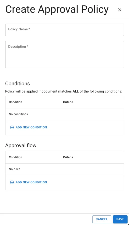
The `ApprovalPolicyDetails` component renders the interface for creating a new approval policy and managing the details of an existing approval policy. This includes the ability to view and edit approval policy details.
## Permissions
To view details of an existing component, the entity user must have `read` permissions for the `approval_policy` object. To create, edit, and delete approval policies, they must also have `create`, `update`, or `delete` permissions for the `approval_policy` object. For more information, see [List of permissions](/api/concepts/authentication#permissions).
## Preview
#### Creation modal preview
#### View modal preview

## Usage
Use the `ApprovalPolicyDetails` component to create a new approval policy and view and edit details of an existing approval policy. To view details of an existing approval policy, use the `ApprovalPolicyDetails` component with the `id` prop as shown:
**`React.js`**
```jsx React.js
import { ApprovalPolicyDetails, Dialog } from "@monite/sdk-react";
...
// TODO: This component must be rendered within the MoniteProvider wrapper
const ApprovalPolicyDetailsPage = () => {
return (
);
};
```
To create a new approval policy, import the `ApprovalPolicyDetails` component without providing the `id` prop as shown:
**`React.js`**
```jsx React.js
import { ApprovalPolicyDetails, Dialog } from "@monite/sdk-react";
...
// TODO: This component must be rendered within the MoniteProvider wrapper
const ApprovalPolicyDetailsPage = () => {
return (
);
};
```
## Props
The following table shows all `ApprovalPoliciesTable` component properties, their types, and descriptions:
| Prop | Type | Description |
| :---------- | :--------- | :------------------------------------------------------------------------------------------- |
| `id` | `string` | This prop accepts the ID of the approval policy details to be displayed, edited, or removed. |
| `onCreated` | `function` | This callback can be triggered when a new approval policy is created. |
| `onUpdated` | `function` | This callback can be triggered when any existing approval policy details are updated. |