> For clean Markdown of any page, append .md to the page URL.
> For a complete documentation index, see https://docs.monite.com/llms.txt.
> For AI client integration (Claude Code, Cursor, etc.), connect to the MCP server at https://docs.monite.com/_mcp/server.
# React components and wrappers
The Monite React UI Component SDK comes pre-built with React components and wrappers that can be used within React-based web applications. The following sections describe these components and their configuration:
## The `MoniteProvider` wrapper
The `MoniteProvider` is the root component that must wrap all other Monite-connected components. The wrapper provides extra configuration for all Monite components beneath it.
First, create an object with the parameters as shown:
```js
const moniteConfig = {
apiUrl: "https://api.sandbox.monite.com/v1",
entityId: "ENTITY_ID",
fetchToken: fetchToken,
);
```
The following table shows all the object properties and their descriptions:
| Property | Type | Description |
| :----------- | :--------- | :----------------------------------------------------------------------------------------- |
| `apiUrl` | `string` | The URL for the API in use. |
| `entityId` | `string` | The Monite entity to which the entity user belongs. |
| `fetchToken` | `function` | A custom function that returns authorization tokens for authenticating subsequent requests |
Then, import and utilize in the `MoniteProvider` wrapper as shown:
```jsx
import { MoniteProvider } from "@monite/sdk-react";
function App() {
return (
...
);
}
export default App;
```
## The `Dialog` component
The `Dialog` component is a wrapper component that wraps Monite React SDK components. The component provides configuration for all Monite SDK components under it. The Dialog component has three props—`open`, `fullScreen` and `alignDialog`—that determine the availability and alignment of its child component(s).
When the `open` prop is `true`, the React SDK component(s) beneath the `Dialog` wrapper is rendered as a modal and aligned to the center of the page by default. The `alignDialog` prop is used to align the component modal to the left or right-hand side. Alternatively, using the `fullScreen` prop renders the component in a full-screen layout.
```jsx
return (
);
```
| Props | Type | Description |
| :------------ | :-------------------- | :---------------------------------------------------------------------------------------------------------------------------------------------------------------------------------------------------- |
| `alignDialog` | (`"left"`\|`"right"`) | This prop determines the alignment of the component. If undefined, the child component(s) of the `Dialog` wrapper is aligned to the center of the page. |
| `fullScreen` | `boolean` | When used, the child component of the `Dialog` components are rendered as a full screen. This prop must not be used together with the `alignDialog` prop. |
| `open` | `boolean` | This prop determines whether or not the `Dialog` wrapper's child component is rendered. If set to `false`, the `Dialog` is closed and components beneath the `Dialog` component will not be rendered. |
> **Warning**
>
> Since the `Dialog` component affects all components beneath it, we recommend bringing in the component at instances where you need to render either the [`InvoiceDetails`](./invoicedetails) or [`CounterpartDetails`](./counterpartdetails) components as modals.
## The `IconWrapper` component
The `IconWrapper` component is wrapper that allows you to customize the closing button of SDK screens. It includes:
* Compatibility with [Material UI theming](https://mui.com/material-ui/customization/theming/).
* Accessibility features, such as customizable `aria-label`.
* Optional tooltips for additional context.
* Dynamic icon swapping on hover.
* Integration of custom event handlers (onClick, onHover).
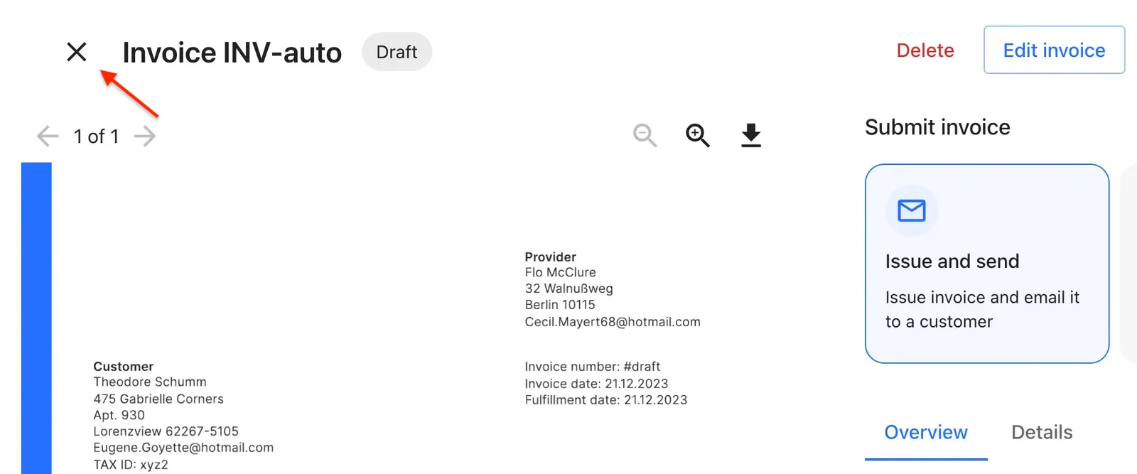
Import the `IconWrapper` component as shown:
```jsx
import { IconWrapper } from "@monite/sdk-react";
return (
}
fallbackIcon={}
tooltip="Go back"
onClick={() => console.log('Icon clicked')}
isDynamic={true}
/>
);
```
The following table shows all the `IconWrapper` component properties and their description:
| Props | Type | Description |
| :------------------ | :--------------------------------------------------------------------------------------------- | :------------------------------------------------------------------------------------ |
| `icon`. | `object` | A custom icon to be displayed, which can be any React node, SVG, image, or component. |
| `fallbackIcon` | `object` | A fallback icon used when `icon` is not provided. |
| `tooltip` | `string` | Tooltip text displayed on hover. |
| `color` | `("inherit"\| "default"\| "primary"\| "secondary"\| "error"\| "info"\| "success"\| "warning")` | Icon color, using MUI theme colors. It defaults to 'default'. |
| `onClick` | `function` | Triggered when button click. |
| `onHover` | `function` | Triggered for hover events. |
| `isDynamic` | `boolean` | Determines if icon changes on hover. |
| `ariaLabelOverride` | `string` | Custom `aria-label` for screen readers, defaults based on icon. |
| `sx` | `object` | MUI system properties for custom styling. |