CounterpartsTable component
Overview
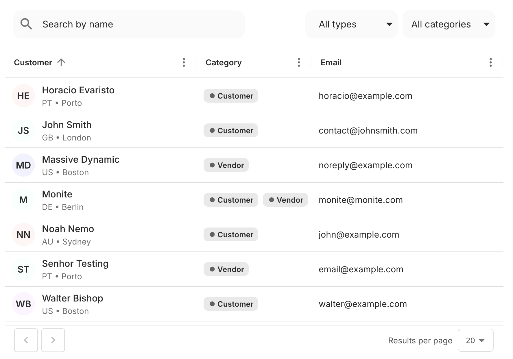
The CounterpartsTable component displays a table with a list of counterparts available to the authenticated entity user. The table displays the counterpart name, type (customer or vendor), country and city, and the default contact (if any). This component calls the GET /counterparts endpoint to fetch the data.
The table supports the following functionality out-of-the-box:
- Pagination: the user can navigate to the next or previous page only. The default page size is 10 items per page.
- Sorting by the counterpart name.
- Searching counterparts by name.
- Filtering by the counterpart type: customer or vendor, organization or individual.
Search, sorting, filtering, and pagination are done at the server side rather than the client side. That is, any change to the table display options triggers a new request to the Monite API to return the adjusted data set.
Permissions
To access this component, the entity user must have read permissions for the counterpart object. For more information, see List of permissions.
Preview
Usage
Use in the CounterpartsTable component in your application as shown:
Props
The following table shows all CounterpartsTable component properties, their types, and description:
The onChangeSort takes one argument whose value is an object with the following fields:
sort- the field name of column whose sort order was changed. For example,policy_name.order- the new sort order, eitherascordesc
The paginationTokens is used to determine the availability of the “Next” and “Previous” buttons at the bottom of the table. For more information, see Pagination, sorting, and filtering.