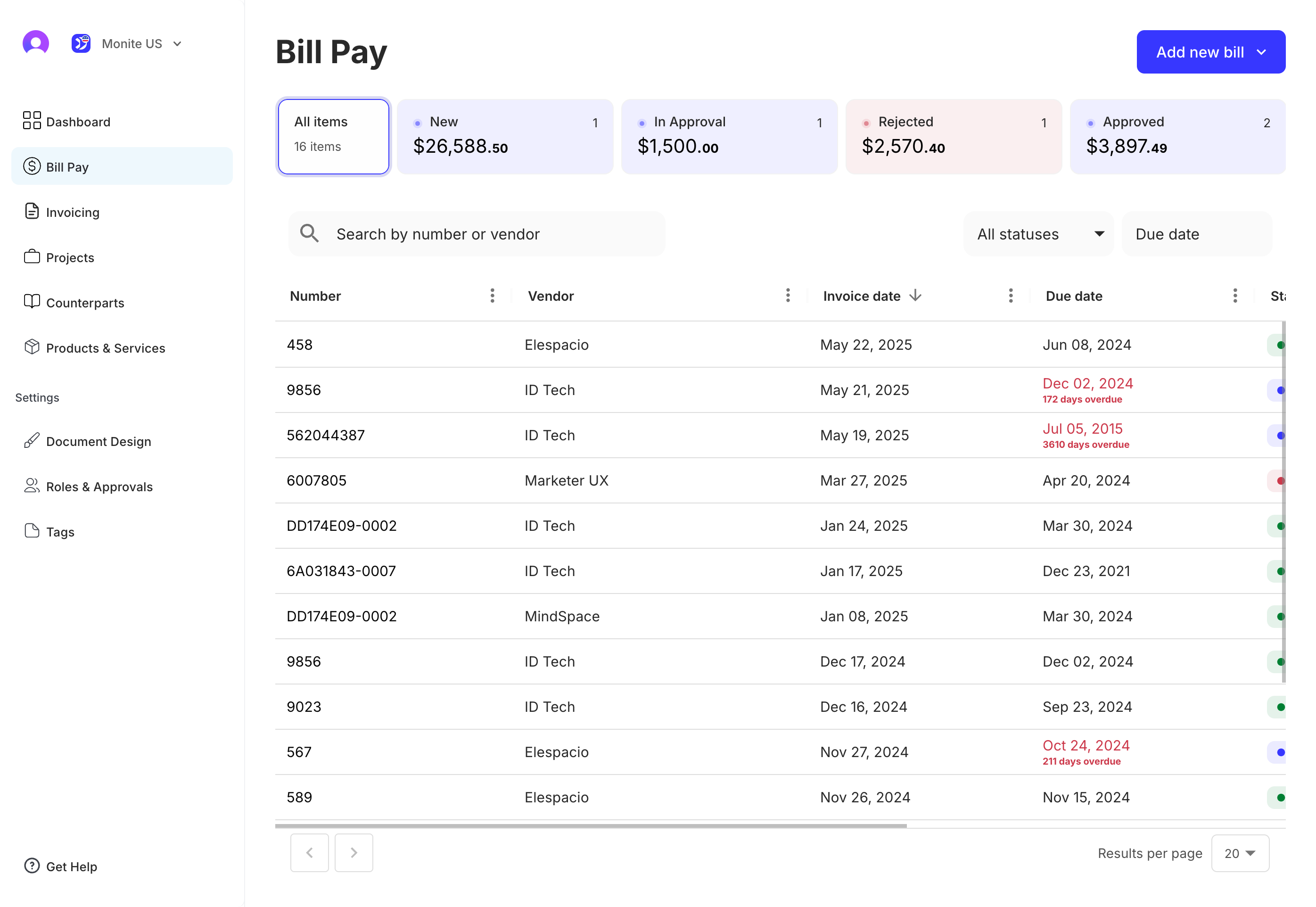
Drop-in overview
Drop-in overview
Use Monite’s Drop-in Components to quickly build your user interface.
Overview
Monite’s Drop-in Components is a fully embeddable UI component library built upon JavaScript’s Web Components. It facilitates the integration of diverse UI elements into your web application. You can choose to bring in individual components or use the library as a single, comprehensive component serving as an all-in-one UI solution.

Drop-in components responsiveness
As of this release, the Monite Drop-in is optimized for desktop use and may not provide the desired responsiveness on mobile and tablet views. We are actively working to enhance support for these platforms in future updates.
Using the Monite Drop-in Components library
You must provide the Monite Drop-in Components library as an NPM package, making it easier to load and use as a module. To use the Drop-in Components package, install the package using your preferred package manager as shown:
Next, import the package into your application as shown:
The Drop-in instance
The Drop-in instance contains the UI and configuration for the Drop-in components. To create a Drop-in instance in your application:
Check all the components you can configure during the Drop-in instance creation.
Authentication
Drop-in credentials
The Monite Drop-in library accepts only entity-user tokens as credentials within the fetchToken function. Attempting to use a partner token with the library will throw an error. For more information about entity user tokens and permissions required, see Generate an entity user token and List of permissions.
If you already implemented a backend part that is capable of issuing entity user tokens, then write a function that retrieves this token.
However, if you have not implemented the backend part yet but can already generate an entity and entity user token, you can also just call the POST /auth/token endpoint directly from this script, as shown below:
Monite does not recommend exposing the credentials of your fetchToken function on the client side as shown earlier. For security reasons, we recommend that all Monite tokens are generated from your server side code.
Theming
You can customize the theme of the component as shown:
Localization
You can customize the locale of the component renderings as shown:
Next steps
You have now learned about the Monite Drop-in component library. For a detailed quickstart guide with detailed usage examples, see Drop-in quick start.