PayablesTable component
Overview
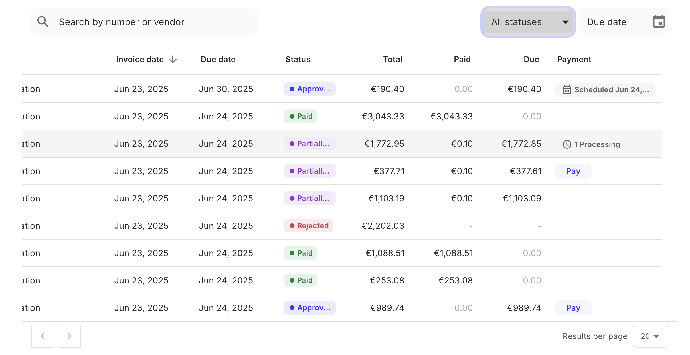
A table that displays the list of payable invoices that are available to the entity user with the access token. The component supports filtering and pagination between these payables. The UI for each table row depends on the payable status on that row. For example, payables in the waiting_to_be_paid status have a customizable “Pay” button to pay the payable. To pay a payable via the “Pay” button, use the onPay prop on the PayablesTable component. For more information, see Props.
Permissions
To access this component, the entity user must have read permissions for the payable object. For more information, see List of permissions.
Preview
Usage
Use in the PayablesTable component in your application as shown:
Props
The onChangeSort takes one argument whose value is an object with the following fields:
sort- the field name of the column whose sort order was changed. For example,created_at.order- the new sort order, eitherascordesc
Customization
Set required columns
The payables.requiredColumns setting defines a list of columns that must always be visible in the UI. Columns listed here cannot be hidden by users. The example below shows all possible values:
Add tabs with filters
You can select additional tabs to be added to the payables table, which will display the results of specific filters. See an example with tabs/filters for unpaid, scheduled, and paid payables:
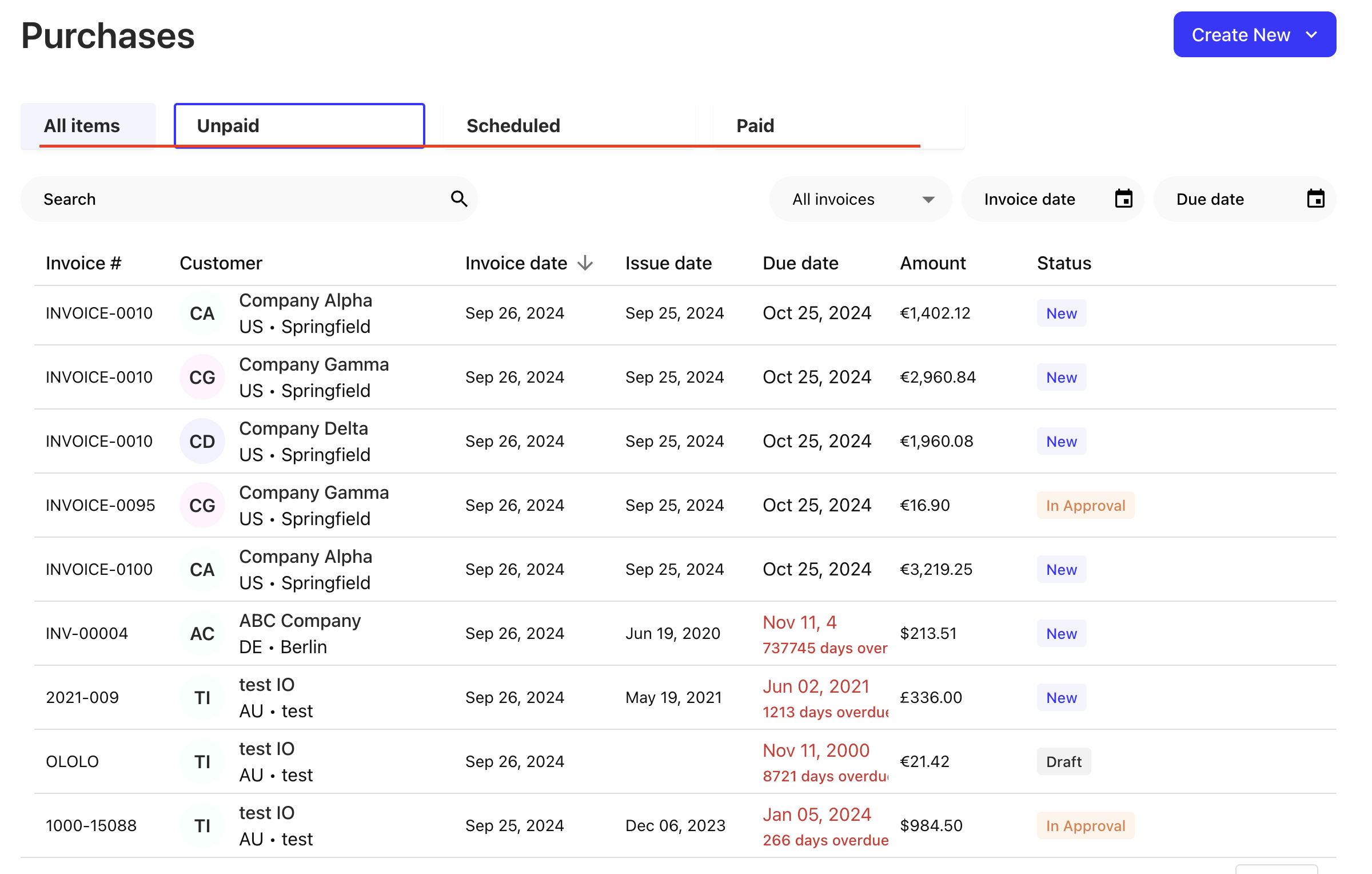
The required fields must be informed in the payables.summaryCardFilters field . Here is an example:
Some fields of the code explained:
Unpaid,Scheduled,Paid- The labels of the tab.status__in- The filters of the tab.
See the GET /payables endpoint for all possible filters.